

I’ve been working on the Algorithms II course from Princeton on Coursera lately, which has been pretty interesting. One of the assignments is on the topic of seam carving, which is a technique for arbitrarily resizing images while maintaining as much of the important detail as possible. It’s also referred to as image re-targeting, coming from the idea of re-targeting an image for a phone/tablet screen with a different resolution and aspect ratio.
Seam carving prioritises important details during resizing
The problem with traditional resizing of images where the aspect ratio is changing is that it requires either cropping or stretching the original image. Stretching makes the main features look warped, especially people, while cropping loses detail – especially if there’s no dead zone on one side that can be cropped away, like an empty sky.
Instead of scaling all parts of the image equally, it can be advantageous to remove more of the dead zone pixels, such as gaps between people in photographs. This is why seam carving has been used to implement Content Aware Scaling in Photoshop. There’s a good example on that page, too.
Seam carving achieves this by identifying the “energy” of each pixel, which is a measurement of the how important to the image the detail of each pixel is. It then identifies horizontal or vertical seams through the image and removes the seam with the least total energy. The seams don’t have to be straight lines, allowing the algorithm to remove paths of low detail pixels that follow the shape of the image.
Colour gradients – a simple measurement of pixel energy
The energy function used will determine the results of the resize. It’s easy to imagine customised energy functions to suit certain types of images. A general purpose approach is to use the rate of colour change around a pixel, and this is the one used in the Algorithms II assignment. The idea is that areas of an image with very little variation in colour have less detail and so are better candidates for removal when resizing.
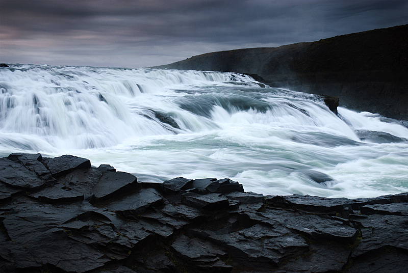
Below is an example showing the energy of a photo and the lowest energy vertical seam that would be removed from the image. The highest energy parts of the photo are the edges between the rocks and water, and the hills and skyline. The detail in the water and rocks does have some energy, but on the whole I was surprised that so much of the photo has low energy, given the level of detail we perceive with our eyes. Presumably this is what allows Jpeg compression to be so effective.
-

- Gulfoss, Iceland (original)
-
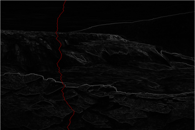
- Energy distribution and vertical seam
Interestingly, it’s also possible to allow user intervention to select areas of the image to either preserve or target for removal. For example, you could highlight people’s faces in order to prevent them being warped, or instead select a person to encourage the algorithm to remove them from the image. All you need to do is give/take extra energy to/from the pixels selected by the user.
There are some good examples in this video from the creators, including using the seam carving not to shrink an image, but to expand it beyond its original size.
Implementation using a shortest paths graph algorithm
The implementation can be seen as a graph algorithm on a weighted directed acyclic graph. Each pixel contributes energy to the three pixels immediately below it. As pixels only contribute energy downwards, there are no cycles in the graph. By finding the shortest weighted path from the top row to the bottom row, you find the vertical seam with the least energy. This is the topological order approach to shortest paths in a weighted DAG. After identifying the minimal seam, its pixels are removed and the process is repeated.
Potential improvements
There are some improvements that could be made to the approach. In their videos and papers, the original creators refer to this approach as “backwards energy”, meaning looking at the image as it was and then removing a seam. This can lead to bringing together two sharp edges that end up having significantly increased energy, which you see in the image as artefacts in lines and edges. They propose using “forwards energy” which takes into account the impact on the image if this seam were to be removed. From my examples, I think this would reduce the artefacts significantly, but I haven’t had time to try it.
Another possibility that occurred to me was anti-aliasing high detail sections along seams that were removed. This may help smooth/soften harsh changes visible when the seam crosses edges in the image, like a horizon line. Although possibly it could cause more trouble than it solves if it results in large areas of the image being blurred over – I haven’t had time to test this either.
Also, as mentioned earlier, allowing the users to select areas of the image to preserve or remove appears to work very well in the demos I’ve seen.
Here’s some I prepared earlier
I tried my code out on some of my own travel photos. Some were handled very well, and some went spectacularly wrong. Images where there’s a distinct horizontal or vertical line across most or all of the photo will typically show artefacts, as the algorithm has to somehow get across those lines from top to bottom or side to side.
My approach was to roughly remove a quarter of each axis of the image, without putting effort into maintaining the aspect ratio. This gives an image with roughly half the area of the original.
Bear in mind that WordPress has resized and compressed the thumbnails. Clicking on an image allows you to navigate through the gallery to compare at larger sizes.
-

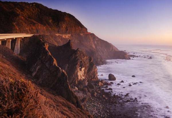
- Big Sur, California (original)

-

- Big Sur, California (retargeted)
-

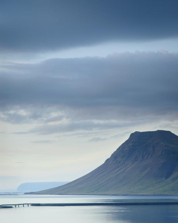
- Snæfellsnes peninsula, Iceland (original)

-

- Snæfellsnes peninsula, Iceland (retargeted)
-
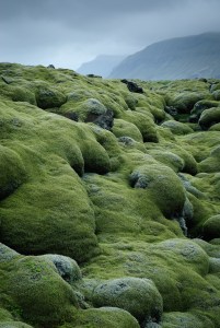
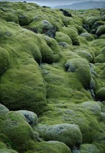
- Lava fields, Iceland (original)

-
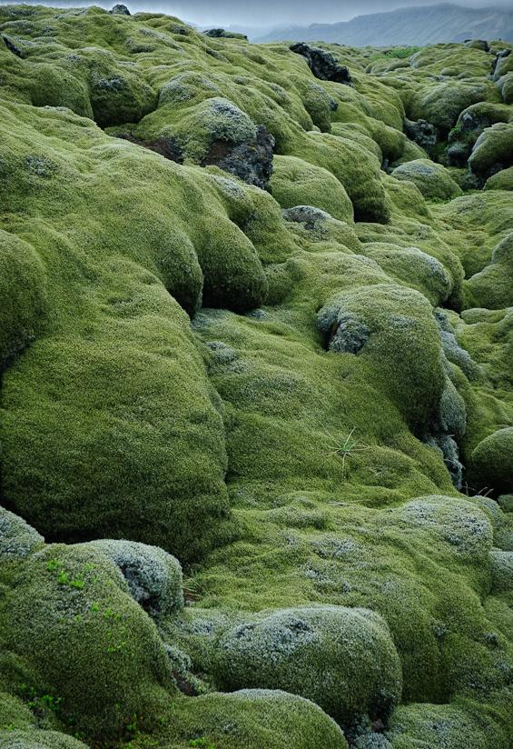
- Lava fields, Iceland (retargeted)
-
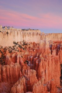
- Bryce Canyon, Utah (original)

-

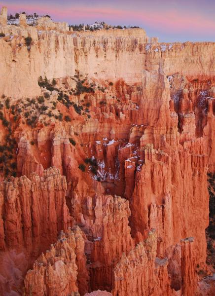
- Bryce Canyon, Utah (retargeted)
-

- Gulfoss, Iceland (original)
-

- Gulfoss, Iceland (retargeted)

