Wine tasting notes – you couldn’t make them up… could you?

Wine tasting notes and reviews are usually an exercise in self indulgence, in more ways than one. Most are completely unrelated to how you’ll actually enjoy the wine – they’re more about making the reviewer look good. And that’s important, because if people don’t think the reviewer has some special, rarefied insight into wine, then no one will care what they say, and they’ll stop being sent free wine and being invited to wine tasting events.

Take Nick Stock’s review of Clonakilla’s top notch 2015 Shiraz Viognier:

The aromatic spectrum is vast, from fine musky florals to white pepper and almost every imaginable spice, then an incredibly exuberant explosion of fruit, boysenberry, raspberry, cherries of every shade, and plums from red to blue and purple; it is full of life.

The palate has an incredibly deep draw, total palate saturation of ripe red cherry, raspberry and red plum flavor, chocolate and a dusting of white pepper. The tannins radiate light and energy, bright from start to finish. Perfectly ripe, seamlessly balanced and actually very approachable.

Drink it now, but there’s plenty to come in time; this will be best from 2022.

The wine may or may not actually be full of life, but I certainly know what the review is full of. Every shade of cherry! An impressive palate indeed.

It makes you wonder how reviewers actually come up with their reviews. I suppose more pithy and factual reviews would quickly become self-similar. But perhaps there’s a market for a tool to help reviewers hone their prose.

Continue reading

Detecting spikes in time series with Reactive Extensions

I recently spoke at NDC Sydney, which was a great experience. My talk was on Real-Time Twitter Analysis with Reactive Extensions. I wanted to have a deeper look into the data and approaches I’d started with the Women Who Code workshop.

I wanted some compelling Twitter data, and given the year we’ve had so far in 2016, politics seemed a good choice. Between Australia’s federal election, the EU referendum in the UK and the US presidential primaries, there was a lot going on in this space. Twitter engagement was huge across all of these events.

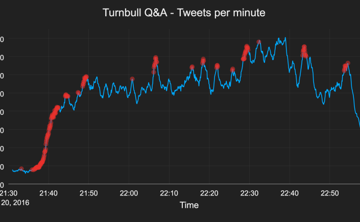
One thing I wanted to be able to do was to plot the rate of Twitter traffic in real-time. This was relatively easy with a couple of lines of Rx, and it gave me a good grasp of the tweets per minute rate through my data.

Continue reading

Solving GCHQ’s Christmas nonogram in 0.07 seconds

GCHQ throws down the gauntlet

A while back I found the GCHQ Director’s Christmas card, which came in the form of a nonogram. GCHQ has a history of puzzle setting and even hiring people through puzzles. The WWII codebreakers were hired through crosswords and other puzzles in the newspaper, which was featured in The Imitation Game.

I was new to nonograms, but quickly found out they’re a “paint by numbers” puzzle where hints for rows and columns give you series of segments (of varying lengths) to colour in. Applying all the clues together logically lets you work out whether each cell is filled in or empty progressively until you reach the final solution.

Typically you then have a badly pixelated picture of something and a sense of accomplishment. With GCHQ’s puzzle, you end up with a QR code that leads you to the next puzzle. So the picture is not very pretty and the sense of accomplishment is short lived. Here’s what GCHQ’s best Christmas wishes look like:

gchq-nonogram

And I thought I was bad at Christmas cards.

Continue reading

Identifying Market Spoofing with Data Visualizations

I love data and data visualizations. They can give deep insight into problems and behaviours, and they can make you interested in something you previously thought dull.

I came across the article “How to Catch a Spoofer” from Bloomberg, by Matthew Leising, Mira Rojanasakul and Adam Pearce. The article gives a fascinating view into the trading activity on the Chicago futures exchange, and how to identify “spoofing” within trading activity. The visualizations take a combination of a difficult concept and large volume of data, and extract genuine, novel insights.

Continue reading

Roomba algorithms and visualization

I once had an interview question asking for an algorithm for a Roomba that ensures it covers every square of a room divided into grid cells, given that the room shape and location of obstacles are unknown. It’s similar to the idea of solving a maze, except that instead of getting to a specific point, you’re trying to visit every point in the room – to clean it!

It’s a pretty common problem, but I hadn’t seen it in the guise of a physical robot before. Running a Depth First Search covers every piece of floor easily enough, but casting it as a physical device that has to move implies a large cost to popping back up the stack that’s generated during DFS. There’s a lot of backtracking in a DFS based approach for a Roomba, so it makes for a slower vacuuming job.

It made me wonder whether there was some better approach than DFS that would be more efficient.

Continue reading

Solving Boggle boards at scale

Princeton’s Algorithms II course includes an assignment on finding Boggle words. Briefly, Boggle is a game where you have a two dimensional grid of random letters and players try to find as many real words as they can from the board by stringing together neighbouring letters.

This post looks at how tweaking the initial implementation can give a 2x speedup, but picking the right data structure gives a 4,200x speedup.

Continue reading

Image resizing with seam carving

I’ve been working on the Algorithms II course from Princeton on Coursera lately, which has been pretty interesting. One of the assignments is on the topic of seam carving, which is a technique for arbitrarily resizing images while maintaining as much of the important detail as possible. It’s also referred to as image re-targeting, coming from the idea of re-targeting an image for a phone/tablet screen with a different resolution and aspect ratio.

Seam carving prioritises important details during resizing

The problem with traditional resizing of images where the aspect ratio is changing is that it requires either cropping or stretching the original image. Stretching makes the main features look warped, especially people, while cropping loses detail – especially if there’s no dead zone on one side that can be cropped away, like an empty sky.

Instead of scaling all parts of the image equally, it can be advantageous to remove more of the dead zone pixels, such as gaps between people in photographs. This is why seam carving has been used to implement Content Aware Scaling in Photoshop. There’s a good example on that page, too.

Seam carving achieves this by identifying the “energy” of each pixel, which is a measurement of the how important to the image the detail of each pixel is. It then identifies horizontal or vertical seams through the image and removes the seam with the least total energy. The seams don’t have to be straight lines, allowing the algorithm to remove paths of low detail pixels that follow the shape of the image.

Continue reading