

I love data and data visualizations. They can give deep insight into problems and behaviours, and they can make you interested in something you previously thought dull.
I came across the article “How to Catch a Spoofer” from Bloomberg, by Matthew Leising, Mira Rojanasakul and Adam Pearce. The article gives a fascinating view into the trading activity on the Chicago futures exchange, and how to identify “spoofing” within trading activity. The visualizations take a combination of a difficult concept and large volume of data, and extract genuine, novel insights.
Defining spoofing
Spoofing is summed up on wikipedia as “the illegal practice of bidding or offering with intent to cancel before execution”. Loosely speaking, spoofing is the practice of market manipulation by placing orders to buy or sell something (eg a stock/option/future, etc) at a certain price, with the intention to influence market perception, and then cancel the orders before they actually execute.
In other words, a spoofer doesn’t actually want to buy or sell 1,000 shares in Google at some particular price, they just want everyone else to think they do. When the market reacts and the price goes up or down, the spoofer cancels their orders and quickly flips to the opposite side of the orders they just cancelled to make money off the market they just influenced. Here’s a visual example, taken from the Bloomberg article:

Discerning spoofing from legitimate activity is hard
Cancelling an order is a legitimate action to take, even if you only placed your order a fraction of a second ago. So just because someone cancels a lot of orders doesn’t make their activity illegal. Compounding this, a spoofer will try to make their activity look as normal as possible. If Google’s shares are currently $700 and a spoofer puts in huge numbers of orders to sell at $1, all at the same time, it’ll be pretty obvious what’s happening.
Proving spoofing requires somehow proving the illegal intention of the trader. To achieve this requires analysing traders’ behaviour to identify cases where cancelled orders are tied to other orders that take advantage of the market ripples the spoof orders created. In a market with thousands of order actions on a particular asset per minute, this is not simple.
Visualisations can reveal complex patterns
The visualizations in the article have a great example tying together the timeline of a spoof. The cancellation of a large number of sell orders, followed immediately by the execution of a large number of buy orders is made clear:
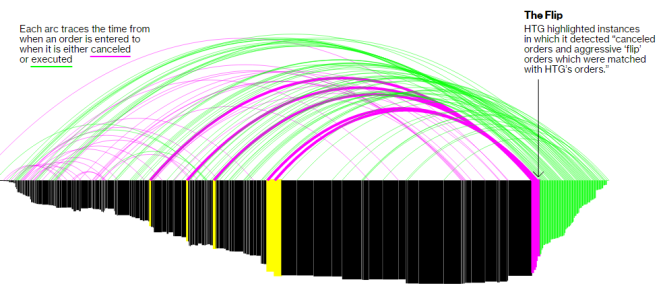
There’s a lot more evidence that would need to be gathered to bring a case to trial, but visualizations like these can raise large, red flags telling investigators that something fishy is going on, and where to focus on looking for more information. The evidence is in the data, but the power is in the visualization.
Wrapping up
Thanks very much to Adam Pearce for permission to reproduce images of the visualizations in this post. There are a lot more visualizations in the article, and they’re animated, which conveys a lot of extra meaning not gleaned from a screenshot. So I’d encourage you to read the article.
Also, if you love visualizations, Adam Pearce’s site has lots of great examples. I spent hours wandering through it. I really find that good visualizations make me interested in data I wouldn’t be grabbed by in raw form.
